The fact-checking project

thefactcheckingproject

In our fact-checking project we focused on the the dutch newspaper “The Telegraaf.” People distinguished the Telegraaf from so-called quality newspapers (like NRC Handelsblad and Volkskrant). They publish also articles on www.telegraaf.nl with different kind of topics: from travelling to cars. In comparison with other websites or newspapers they publish more about entertaining topics than serious topics. We checked the facts of five articles from the rubric “Health.”

The first article was about “Breastfeeding decreases risk on breast cancer.” In this article the main findings of the fact-check process were that some numbers could not be accounted by other sources or articles. The journalist did not fact-check the story and just wanted to write an article quickly. In order to write a good article, the journalist should have embedded links to the sources she used and contacted them to get the assumed press release of the study. In that way she could have checked the numbers herself.

The second article was about “30 percent of the cancer cases could be prevented.” In this article they used the ANP as the source. The journalist said that this was a reliable source that does not have to be checked at all. However, the results of the fact-check process suggest the opposite. ANP is getting their information of other organizations. As a consequence, as a journalist you have to check also the facts of the source of the ANP, but it seems that the journalist of the Telegraaf has not enough time to do that on her own.

The third article that was fact-checked was: “Super bacteria is deadlier than cancer by 2050.”

In this article, estimates were published as facts, hasty conclusions were made and information had been used from a source which is not the original. But most important: the readers were misled. The title was more sensational than it actually was. The source did not provide any information to confirm this statement.

The fourth article was about “Multi-resistant bacteria in fish from Asia.” As in the second article about cancer, the journalist explained that she also used ANP as a source and therefore was perceived to be correct. She did not checked the source on correctness. However, the ANP was not named in the article as a source so you did not knew where the information came from and whether it was reliable or not. In addition, the journalist made a generalization that in our opinion was incorrect (they used a small sample for their statement).

The last article we fact-checked was about smoking: “One out of ten youngsters is a heavy smoker.” In this article they used a lot of numbers and percentages, but no cohesion or links, although it was given in the original source. The article was less detailed compared to the source and did not show the total amount of the percentages. The journalist admit that she was really struggling with the numbers and did not knew how to report it in a good way.

In the end we can say about this fact-checking project that the articles that we checked contained a lot of faults. It seems like the journalists of the Telegraaf report the news without a prior check of the facts. This is not a good way of conducting news and decreases reliability. To stay a reliable news source, telegraaf.nl should properly check their sources double and give links to their sources they used for their articles. Several point of views are missing. Often one source is used, so you hear the story from one side. This is a point you see in all the articles we fact-checked: less depth, mainly acquired facts and numbers from other studies but no relevance, conclusion or cohesion. Our conclusion: for in-depth articles do not read the Telegraaf, but if you are in the mood for some entertainment: go for it!

Visuals: one piece of an advanced puzzle

Last week, Carel van Wijk talked in his presentation about the reliability of visuals. He states that pictures may take different forms when they go around the world. He argues that the use of Photoshop is one of the causes for this. Today, I am going to talk about the appearing of different forms of visuals (pictures as well as videos) in various newspapers about the same news topic and in special about visuals that shows the situation in a war zone.

Framing visuals
Earlier, I talked about news framing and agenda-setting of the stories they tell in the newspapers, but you can also frame visuals. One classical example of this is the toppling of Saddam Hussein’s statue in the Iraq War on April 9th, 2003. An event that was visual portrayed in all the media worldwide. In the research ‘They took it down’ of Fahmy, they examined the visual framing across newspapers of the toppling. They concluded that, in overall, the U.S. newspapers used a victory/liberation frame for the news of the toppling. They reported the happening as that the Iraqi people received the U.S. forces as ‘liberators’ and some of the media even compared the event with the removal of Lenin statues and the fall of the Berlin Wall. Only a few media were more critical. The following videos show that the event actually was visually framed.

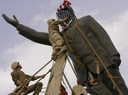
Not only in the videos they used visual frames. When you look at the three pictures below, you see three different pictures of the toppling of the statue. All these pictures stopped the time of the event. This means, when you weren’t there at the moment that the picture was made, you totally miss the context of the picture. As a consequence, you are completely dependent of the story that the people tell you and at this point the media organizations come in to the story. They can choose the story they want to tell to their audience. According to Fahmy, many U.S. media took shots of the toppling at close range or cropped them tightly. When you take a look at picture 1 (which appears in the New York Times) and you think of the ‘liberating’ story that the U.S. media told their audience, it looks like that there was a crowd of jubilant Iraqis celebrating the toppling with U.S. soldiers. This way of photographing makes it very difficult to estimate how large the crowd really is. When the photographer would have taken a long-shot photograph the situation would have looked a lot different. You can see this in the second picture. The whole square is depicted and it is actually quite empty; only at the foot of the statue you see a really small crowd. A contrary story of this situation can made with picture 3, were the photograph take close pictures of the action. This picture can visualize a situation of an invasion and occupation of the U.S, because the only thing that you see is the U.S. soldier that drapes a flag of the U.S. over the face of the statue.

Screen Shot 2014-12-07 at 14.19.26

Picture 1 ‘Jubilant Iraqis celebrating the toppling with U.S. soldiers’

saddamStatueMed

Picture 2 ‘A long-shot photograph of the square’

saddam-statue1

Picture 3 ‘An U.S. soldier drapes a flag over the face of the statue’

Fahmy also state that journalists, during the war, are less objective to support their country’s troops and their government’s position on the war. The results of another research of Greenwood and Jenkins show that the international news about the Syrian conflict is often visually framed in terms of violence and disaster. In other words: the pictures depicted most often the active participants and aftermath of battle instead of the affected bystanders or efforts to negotiate peace. Besides this they conclude that the framing depends on the kind of magazine: the news magazine published more with violent frames and public relation magazines more with peaceful frames.

In conclusion, in my opinion the use of Photoshop certainly can be one of the causes of varying pictures across newspapers and different videos, but the chosen frame and the goals of the news organizations have also an influence on it. As a consequence, I have to conclude again that it is important to read more than one news source to check the information you read. Especially, when the news goes about war. In addition to this advice, you have to ask yourself questions about the context when you look at a picture. A picture without a context can be interpreted in so many ways. Therefore, read more articles of several sources and look critically at pictures to complete your own reliable news puzzle!

Der Spiegel fired 50 fact checkers

truthometerfalse-300x265

The judgment of the title

Shocking number isn’t it? But is it true? No, it isn’t of course. You can take that from me, because I totally made it up. But normally a journalist has to check this kind of information. They call it fact checking. Only a few newspapers employ fact checkers. One of them is the German newspaper Der Spiegel. Since 2010, it goes around that they have 70 fact checkers in service. In contrast, the New York Times only have 16 fact checkers. These numbers are based on an article of Craig Silverman. In the meanwhile, there are several organizations that started, for example, with checking the facts that are said by the politicians of their country (politifact.com and AZ Fact Check). According to Craig Silverman, there is a whole process that lies behind the question ‘Is the fact true?’. In this blog post I will present you this process (of course with an example) and I am going to ask the question whether the fact checking process is still the responsibility of a journalist or not.

The process of fact checking
Reynolds Center for Business Journalism created an accurate checklist for journalists. The first section of this checklist (see picture) consists of four questions to check the facts you used in your article.

Screen Shot 2014-11-30 at 14.31.45

Section one of the accurate checklist for journalists

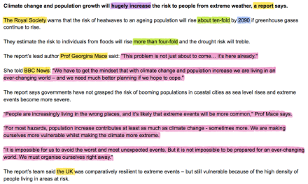
The picture below shows a section of the article ‘Risk from extreme weather set to rise’ published by the BBC. In this picture I carried out the first step of step four of the checklist. I highlighted names and titles yellow, numbers and calculations green, dates and ages blue, quotes pink and superlatives purple. According to the Reynolds Center for Business Journalism should all these facts been double-checked before the BBC should publish the article.

Screen Shot 2014-12-01 at 16.12.06

A section of the article ‘Risk from extreme weather set to rise’

In this section of the article they already used every kind of fact that are mentioned by Reynolds Center for Business Journalism. When I look at the picture I personally miss one kind of fact. In the article they constantly refer to ‘the report’. This raises a few questions in my mind: ‘What report?’, ‘What’s the title of the report?’ and ‘Who carried it out?’. Therefore, in my opinion, there needs to be added one criterion at the checklist: Is every source concretized enough?

Back to the process of fact checking, supposing that the rest of the article also consists of many facts, you can imagine that the number of facts in an article can be very high. Consequently, the duration of the fact checking process will be long. Journalists of an organization without a fact checking department have to check the facts by themselves. You can understand that it is almost impossible to write an article, check all the facts and check in the meanwhile the other five paragraphs on the list of Reynolds Center for Business Journalism. In this point of view I can agree that it couldn’t be any longer the responsibility of the journalists to check all the facts. They can’t simply bear the responsibility, because they have not enough time to do it. But does this mean that the people have to learn fact checking by themselves? I don’t think so. I do think that it is a good thing that the people know that not all what is in the newspapers is true, but you can’t demand of the people that they are going to check the facts by themselves. The people simply want to read the news and stay updated.

Screen Shot 2014-12-01 at 21.32.12

Today’s edition of Der Spiegel

Due to the fact of the upcoming fact checking organizations, there is certainly a need for fact checking. But if we don’t change anything of the fact checking process, the people have to read the newspapers and must stay updated by the fact checking organizations. Maybe we have to take a better look at the fact checking process of the German newspaper Der Spiegel. They organized their fact checking department by areas of expertise (i.e.: politics, science, economics, foreign affairs, culture, sport and medical). Besides this, the factcheckers do not only check the facts, they are also involved in the writing process. This results, in my opinion, in a more efficient method than the method of the New York Times, where the fact checkers see the article for the first time when it is finished or close to finished. So that means that they aren’t involved in the writing process.

In conclusion, I think that it is still the responsibility of the news organizations to check the facts. Besides this, I think that it is better that they employ fact checkers than let the journalists check the facts by themselves. This may cost a lot of money, but at the end I think that it makes your news organization more reliable.

One article isn’t the world; it’s just one version of it

The inspiration for the title came from the Dutch journalist Joris Luyendijk. Years ago I read his book ‘Het zijn net mensen’ (in English: ‘Hello everybody’) and always when the topics ‘agenda-setting’ and ‘news framing’ come across, I have to think about that book. Especially about one episode. He also tells about this episode in an interview about the situation in the Middle East in the Dutch television program ‘Tegenlicht’ (unfortunately only in Dutch).

In the episode he wrote about a suicide attack on a bus in West Jerusalem. All the passengers of the bus were killed. This accident fits well in the agenda-setting of president Sharon and he gave his men the order to leave the dead bodies until he was arrived. He did this with a particular reason: in this manner the news organizations could film him on the crash site. When I read this book 8 years ago, this episode really opened my eyes. For now, we will first take a look at the process of news framing and we will discuss whether use of frames is a good or bad thing.

According to Claes de Vreese, the process of framing consists of several stages: frame-building, frame-setting and individual and societal level consequences of the framing. When you look at the picture ‘An integrated process model of framing’ you can see that there are several steps in the process. First of all when journalist are making a news article, they have to think about how they want to frame the story. This doesn’t only depend on internal factors, but also on external factors like social movements. The outcomes of the first step are the frames that will be used in the news. There are many kinds of frames but in this model they only make a distinction between issue-specific frames and generic frames. Issue-specific frames refer to frames that are pertinent and only for specific topics or events. Generic frames don’t have to deal with thematic limitations and they can be identified in relation to different topics. The last step ‘frame-setting’ focuses on the interaction between media and predispositions of the individuals. The frame-setting can have an effect on individual level but also on societal level (e.g. political socialization and decision making).

Screen Shot 2014-11-24 at 21.28.31

An integrated process model of framing – Claes de Vreese

When you take a closer look at the different sort of frames, Semetko and Valkenburg identified five general news frames:

  • The conflict frame describes a conflict between individuals, institutions or countries.
  • The human-interest frame presents an event or issue in such a way that either the government or an individual attribute the responsibility for the cause or solution.
  • The morality frame presents an event or issue in the context of religious tenets or moral prescriptions.
  • The economic consequence frame describes the issue in terms of the economic consequences it will have on individuals or countries.

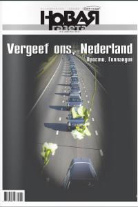
After all these theories, the biggest question that remains about frames is still: ‘Is it good or bad to use frames?’. Personally, I think that it is impossible to write an article without any use of frames. When you write for a particularly newspaper or magazine you have to write for the audience of the paper or magazine. Consequently you write about things they like to hear. So, I think in this situation it isn’t wrong to use frames, but I think that the frames also can be used in a bad manner. One example of the conflict frame is about the news period after the crash of MH17. Especially in the first week, the allegations flew back and forth between the Ukraine, Russia and the West. All that Ukraine said was contradicted by Russia and visa versa. At the same time the people in the Russia heard other stories than the people in the West. They positioning their selves in a victim role, because they had done all what they could to ensure that the conflicting parties would negotiate with each other. Besides this, the Russian believed that especially this development was a very positive one for the United States. Only a few newspapers took a critical look at the situation and one published even an apology.

krant-rusland-vergeef-vergeven-groot-AFP_0

Bron: RTL Nieuws

In this situation I think that it can be dangerous to use such frames, because the effects are on societal level. All these different frames influence the attitude and behavioural of the Russia people about the Ukraine, the US and the West. Before you know, it has stir up an entire population. Especially, in times of war or conflicts between countries it will always be difficult to know the truth. Sometimes it seems that there is not only an ‘ordinary war’, but also a media war. I think that we, in such situations, can’t do anything else than to keep critical by yourself and take the knowledge of several news organisations. Therefore, I hope that there will always be some newspapers with a critical and objective eye and that they are available for everyone. In this manner you can combine the several versions and create a more complete picture of the world.

Don’t throw it all away!

Every year since 1979, the Society for News Design holds a competition called “Best of newspaper design”. This competition isn’t about the news that is written in the paper, but just about how it looks. All the newspapers and magazines from the whole world (daily or non-daily, broadsheet or tabloid, traditional or alternative) can join this competition by sending in their best pages of the newspaper or magazine. According to the Dutch newspaper de Volkskrant, the judge looks at different categories. One of the judges, Bob Unger of the Standard-Times, said about the category ‘Small graphics’ that there are still many newspapers which try to cram too much information in one illustration with chaos as result. Elegancy and simplicity would be, according to him, the solution.

Alberto Cairo

Alberto Cairo

But if we can believe Alberto Cairo isn’t design the only factor for a successful graphic. He state in the Doing Journalism with Data course that a great visualization depends on four features, namely: Functional, Beautiful, Insightful and Enlightening. In this blog post we will first look at these four values and we will end the blog as usual with an example in which we will discuss this topic.

The four features of a great visualization
As mentioned before a great visualization of data depends on four features, but what do they actually mean?

Functional: When you are judging the functionality of your visualization you have to think about the following questions:

  • Let the visualisation see the trends and patterns you want to show? And/or are there better forms of graphics to show it?
  • What questions would you like to answer with your visualization?
  • Are these questions the questions that the audience also would like to see as being answered?
  • Can I read the graph without looking at every single value?

Beautiful: It is important that the visualization is attractive; otherwise the readers will not stop and interact with the visualization. So, keep the aesthetic level of your graph high, but don’t think that beautiful the only feature is that matters.

Insightful: Visualizations get insightful when it reveals things that are unexpected, surprising or extremely important. To create an insightful visualization it is important to put your data in context. So, don’t throw some data at your readers, but introduce them to your audience. You can do this with the so-called annotation layer in which you write a proper headline, a short introduction and explain the context of the data for the visualization.

Enlightening: Enlightening graphs are graphs that reveal things that you didn’t know about before. They change the mind of the reader on a certain topic or phenomenon.

Enlightening graphs about the VS?
Let me first tell you in short the story of Linda Tirado. Linda Tirado is an American woman (32), who has a young family. To support her family she works around the clock at two low-paying jobs. As many other people in America, she knows what it’s like to simply keep yourself and your family in life with no money and little energy (because of the hard working). In the autumn of 2013 she read a blog post of a woman who questioned herself why poor people keep making bad decision. This woman based her blog post on a visit at the grocery where she saw poor people with an Iphone. In reaction on this blog post Linda Tirado wrote a blog post with the title “Why I Make terrible decision, or, poverty thoughts”. This post became very popular and results in a book launch in the VS and the UK two weeks ago.

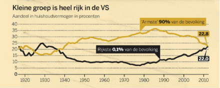
So, you will think, oke nice story, but what has it to do with visualization of data? I will tell you in a second. To introduce the story in the Netherlands, the Dutch newspaper ‘de Volkskrant’ wrote last weekend an article about the book of Linda Tirado. What they actually did: they wrote exactly the same introduction that I did, but then more extended. Beside this description they also put graphics at the bottom of the page (showed below). When I first read that article, I didn’t mention the graphs at all.

Screen Shot 2014-11-16 at 13.15.45

The left graph shows the poverty in the VS and the right one shows the percentage of the poor in the VS who are working.

Screen Shot 2014-11-16 at 13.24.06

This graph shows the data about the capital per house holding of the poor and rich people in the VS.

Screen Shot 2014-11-16 at 13.24.38

This graph has a heading which are telling you: the development of the national hourly rate in the VS and the text beside the graph tells you that 4,9% of the American people have more than one job.

Assuming that Alberto Cairo is totally right with his four values, we firstly can conclude that the graphs are not attractive enough. After all, they didn’t catch my eye. Beside that, the insightfulness of the graphs is also low. The graphs didn’t have an introduction and explanation to the context. You have to guess by yourself why they are there. In this situation I think that the journalist want to give us some extra background information of the situation of the poor people in America, but is that really enlightening information? Most people know that already. Furthermore, I couldn’t read the graph without looking at every single value in the graph and I also want to compare the two first graphs. So, the functionality of the graphs can also be judged as low.

However, when I critically look at the four values of Roberto Cairo I can’t agree with all the elements. For example, I don’t think that every graph has to be enlightening to be successful. They can also have a great reminder or background function. Further, they don’t always have to be very attractive. Off course, it also counts, but when a graph gives the right information it will be also good enough in my opinion. There is one point that I certainly agree on: the annotation-layer can’t be missed. Otherwise, you are indeed throwing some data to your audience and that would be a waste of your time and above all pity!

Check check double check!

Have you ever doubted the numbers in a news article? That isn’t crazy at all. A misinterpretation of the results of a research or a large data file is easily made. As a consequence, the information that is spread with the written news article will contain false assertions. In some cases is the fault too obvious and you will doubt the information, but most of the time the people will think that the assumptions are certainly true. To reduce these false assertions, the Dutch newspaper NRC Next created a new rubric a few years ago. In this rubric, called ‘Next checkt’, editors check whether particular newsworthy assertions are true or not. NRC-next-checkt

They are not the only one with this kind of rubric; in America there were already whole organisations that started with fact checking in the media. In this blog we will take a look at some faults that can be made when you want to turn numbers in a news article. At the end we will look at an example of a news article in which it went wrong.

The risks of making data interpretations
In data journalism there are five important W questions, namely: Who?, What?, When?, Where? and Why? (Rogers). First of all, it is important to get an answer on the question ‘Where did the data come from?’. Can you say that it is a trustworthy source? The more reliable the source, the greater the chance that the data is correct. Beside that, the transparency about your source is important too. If a reader can see from where you got the data, the more he trust you. In this first part, you can already make a mistake, by believing a trustworthy immediately. So even when it is a reliable source, it is really necessary to question all the numbers you get in a data. The second step in the process is to create a clear story with the numbers in a way that readers can follow easily. It is certainly easy to write a good story about something when you have amazing numbers, but stay close to the real numbers. The third question deals with how old the data is that you collect. How younger the data that you gathered, how more up to date you are. The last two questions are about whether you can find more and other data to combine for a new story and whether you can correlate the different data collections.

The Dove self-esteem research
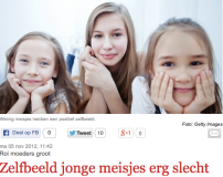
Screen Shot 2014-11-10 at 10.58.43In November 2012 the Dutch newspaper Telegraaf published an article with the title ‘Low self-esteem young girls’. This assertion was based on a self-esteem research carried out by Panelwizard in order of Dove. Afterwards, Dove claimed that merely one out of ten girls found themselves beautiful. If we can believe the editors of the rubric ‘Next checkt’, this claim gives a more negative perception of the situation than the research of Panelwizard first suggested (click here to read the article of ‘Next Checkt’ about this topic). The online questionnaire literally asked the girls to assess themselves. 11,9 per cent of the 503 Dutch girls between the 10 and 17 years measured themselves as ‘beautiful’. This is in line with the claim, but the editors suggest that there were more positive words than ‘beautiful’ that the girls could select: attractive (3.5 per cent), fun (33.9 per cent), hot/flashing (1.3 per cent), natural (6.3 per cent) and sexy (0.6 per cent). Only a small group (3.7 per cent) agreed with negative words (unattractive, ugly and unremarkable). The editors suggest that when you sum all these per cents, you could say that 57.5 per cent of the 503 Dutch girls are positive about themselves. This is also not entirely true, because some girls select more words than other girls. However, you certainly can’t say that the self-esteem of the girls is very low. Furthermore, the editors suggest that the research didn’t specify the term self-esteem. What is self-esteem, is that only the look? Finally, you can ask yourself whether the results that Dove showed were objective. When you take a look at the website of Dove than you see that they offer a self-esteem program to improve your self-esteem. You can join this program as parents, but also as a teacher or school.

Screen Shot 2014-11-10 at 11.44.05

So… What went wrong with the W questions?
In this example the journalist already went wrong by the first question ‘Who?’. The source wasn’t reliable enough, because they also had other interest with the results. He didn’t check other sources, which would have showed, according to the editors of ‘Next checkt’, the opposites results of Dove. If he would have checked other sources, he was also in the position to check the numbers with the result that the numbers stayed closer to the real numbers. On the other hand, the results would have been less fascinated than Dove presented them. In that case you can question yourself whether the numbers would still newsworthy enough or that the article wouldn’t have appeared at all.

Publish first, correct if necessary?

To give an indication: In the last 60 seconds, there were posted around 293.000 Facebook status updates, 433.000 Tweets were sent and over 5 million videos were viewed on Youtube (Qmee, 2014). Maybe you find this numbers already fascinating, but look at them again and think about the following: all these numbers repeat every 60 seconds of every single day of the year and do increase enormously fast (Qmee, 2004). We do not only use it for the fun and entertainment, but we also use it to gather and create news. The ability for anyone to upload content has not only effect on our daily lives, but also on journalism (Silverman, 2013).

Verification of user generate content
Most of the time we share innocent content about our lives, but sometimes we play the role of an ‘accidental journalist’. Everybody who is just at the right place and the right time to recording a news event, can take this role (Silverman, 2013). For the real journalist, who has no access to the place of the event, is the content of the accidental journalist more valuable than the accidental journalist probably thought at first. Before the journalist can use the content, he has to check if the content is correct. Silverman (2013) describes four elements, which are important to check and confirm:

  • Provenance: Is it possible to confirm the authenticity of the piece of content?
  • Source: Is it possible to confirm the source?
  • Data: Is it possible to confirm the date of the event?
  • Location: Is it possible to confirm the location?

In the reality it is relatively rare that all of these elements provide a clear answer (Silverman, 2013). At the end, it relies always on the editorial decision whether to use the piece of content or not (Silverman, 2013). In the next paragraph this last decision will be discussed by an example of Tweets of Dutch Jihadists in Syria.

Dutch Jihadists murdered in Syria
Since the first video from the IS of the beheading of James Foley August last year, are much Western countries in the grip of the news of the situation in Syria. Also in the Netherlands you can read some news about the activities in Syria every week. On September 23 several Dutch newspapers and channels published an article about killed Dutch Jihadists in Syria (De Volkskrant, 2014; Nieuwsuur, 2014; Telegraaf, 2014; NOS, 2014). In the article of the news organisation NOS was this news primarily based on the following report on Twitter:

Screen Shot 2014-11-04 at 09.43.54

In this tweet Muhajiri Sháám claimed that at least a Dutch Mujahideen and martyrs were killed during the airstrikes on his location in West Aleppo. As mentioned before, Silverman (2013) suggests that the verification process consists of checking four elements (provenance, source, data and location). Silverman (2013) set up several questions to check these four elements. Some of them are:

  • Can you identify the person who shared/uploaded the UGC, and contact them for more information?
  • When was the first version of it uploaded/filmed/shared?
  • Can you identify the location? Was the UGC geotagged?
  • Are any websites linked from the content?

After September 23 the account of Muhajiri Sháám has been suspended, so at the moment of this writing, it was no longer possible to verify his account and the content that he had written. However, in the article on September 23 of NOS (the biggest news organisation of the Netherlands) they already said that they could not confirm that Muhajiri Sháám was really stationed in Aleppo. They only could say that he did more report in the days before September 23. Based on that information the NOS decided to place the Tweet and wrote an article about it, called: Jihadist mentioned on Twitter that Dutch Jihadists are killed. Later that day, several authorities confirmed that indeed three Dutch Jihadists were killed during the airstrikes (De Volkskrant, 2014; Nieuwsuur, 2014; Telegraaf, 2014).

This situation raises some questions. Why should the NOS places that content, while it is not confirmed at all? In this case the authority could confirm the news later on the day, but what if they could not? Rumours and misinformation are fundamental characteristics of emergency situations (Silverman, 2013). Especially in this case of the tweeting Dutch Jihadist, it would have been wrong news about a topic that already was loaded with anxiety. In my opinion the news broadcast organisations have the role to prevent the people for rumours and unnecessary anxiety. Unfortunately, if we have to belief the results of a research about the impact of social media from ING among an international group of 165 journalists and 186 PR professionals, most journalists are not thinking the same about it (ING, 2014). The results of that research shows that a large number of journalists (80%) do not check the facts before they publish an article (ING, 2014). Hopefully, the trend of ‘publish first, correct if necessary’ will blows over soon and will certainly not be the new mantra among journalists.

Literature

ING (2014). 2014 Study impact of social media on news: more crowd-checking, less fact-checking. Retrieved from: http://www.ing.com/Newsroom/All-news/NW/2014-Study-impact-of-Social-Media-on-News-more-crowdchecking-less-factchecking.htm

Nieuwsuur (2014). Ook drie Nederlandse jihadisten dood bij aanval. Retrieved from: http://nieuwsuur.nl/video/701983-ook-drie-nederlandse-jihadisten-dood-bij-aanval.html

NOS (2014). Jihadist meldt Nederlandse doden op Twitter. Retrieved from: http://nos.nl/op3/artikel/701749-jihadist-meldt-nederlandse-doden-op-twitter.html

Qmee (2014). Online in 60 seconds – A year later. Retrieved from: http://blog.qmee.com/online-in-60-seconds-infographic-a-year-later/#comments

Silverman, G. (2013). Verification handbook. Retrieved from: http://verificationhandbook.com/

Telegraaf (2014). Nederlandse doden bij luchtaanvallen Syrië. Retrieved from: http://www.telegraaf.nl/binnenland/23113917/__Nederlandse_doden_bij_luchtaanvallen_Syrie__.html

Volkskrant (2014). Drie Nederlandse jihadisten gedood in Syrië. Retrieved from: http://www.volkskrant.nl/binnenland/drie-nederlandse-jihadisten-gedood-in-syrie~a3753106/